本ページは広告が含まれています。気になる広告をクリック頂けますと、サーバ運営費になります(^^
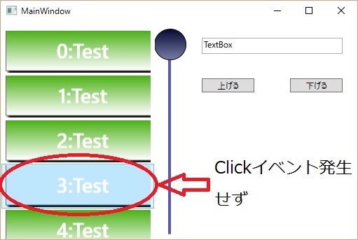
WPFで、Listboxを用い、その中にボタンを配置した時のタッチ操作です。
どうも操作感がイマイチで、Clickイベントが発生する場合と発生しない場合があります。タッチの仕方によって、Listboxの行が選択されたようになります。
こちらに質問したら、親切に教えていただけました。ほんと助かります。
https://social.msdn.microsoft.com/Forums/ja-JP/eec04319-4e9c-43b8-b0fd-35e00515de66/listbox-?forum=wpfja&prof=required
Listboxの上でタッチする際に、指が少しでも動いてしまうと、スワイプしたような状態になりClickイベントが発生せず、TouchUpとかその他のイベントが発生して、行選択状態になるようです。教えていただいたコードとしては、
Xaml上で プレス&ホールド(長押し)動作を無視する
https://msdn.microsoft.com/ja-jp/library/system.windows.input.stylus.ispressandholdenabled(v=vs.110).aspx
プレス アンド ホールドは、マウスの右クリックにマップされます。Windows Vista では、ユーザーがタブレット ペンを押したままにする可能性があり、右クリックをシミュレートする必要のない要素上では、この動作を無効にできます。
l_listbox_PreviewTouchMoveを無効にする
private void l_listbox_PreviewTouchMove(object sender, TouchEventArgs e)
{
   e.Handled = true;//ホットトラックを無効に
}
http://www.atmarkit.co.jp/ait/articles/0411/19/news111.html
「e」のHandledプロパティは、イベントを処理したかどうかを設定するためのもの
HandledプロパティにTrueを設定している。これにより、コントロール側のKeyDownイベント・ハンドラは呼び出されなくなる
https://msdn.microsoft.com/ja-jp/library/ms754010(v=vs.110).aspx
ユーザーがその要素内で指を移動すると、それに従って TouchMove イベントが複数回発生します。
previewイベント
https://msdn.microsoft.com/ja-jp/library/ms752279(v=vs.110).aspx
プレビュー イベントはトンネル イベントとも呼ばれ、アプリケーション ルートから、イベントの発生元でありイベント データでソースとして報告される要素へ向かって経路をたどるルーティング イベントです。
特定のイベントがコントロールから生成されるのを抑制し、コンポーネントで定義された別のイベント (より多くの情報を含むイベントや、より具体的な動作を表すイベント) に置き換える場合もあります。
http://blog.okazuki.jp/entry/2014/08/22/211021
バブルイベントが、イベントの発生元から親要素・親要素…へ伝搬していくのに対して、トンネルイベントはルートの要素からイベント発生元のオブジェクトの順番でイベントが伝搬していきます。(ちょうどトンネルイベントの逆の動きになります)
ルーティングイベントは、RoutedEventArgsのHandledプロパティをtrueにすることで、後続のイベントをキャンセルすることが出来ます。この機能を使うと、トンネルイベントやバブルイベントを途中でインターセプトして後続のイベントの処理をキャンセルすることが出来ます。
親を探せ
        private T FindParent<T>(DependencyObject d) where T : DependencyObject
        {
            while (d != null)
            {
                d = VisualTreeHelper.GetParent(d);
                if (d is T)
                {
                    return (T)d;
                }
            }
            return null;
        }
previewTouchDownへの処理
        private void B_test_PreviewTouchDown(object sender, TouchEventArgs e)
        {
            e.TouchDevice.Capture((Button)sender);//ボタンから外れても大丈夫なようにキャプチャする

            Button btn = (Button)sender;
            btn.TouchUp += Button_TouchUp;
            e.Handled = true;

            //タッチポインタが動いても他のListBoxItemにホットトラックされないようにする
            ListBox listBox = FindParent<ListBox>(btn);
            listBox.PreviewTouchMove += l_listbox_PreviewTouchMove;
        }
TouchDevice.Capture メソッド
https://msdn.microsoft.com/ja-jp/library/dd989302(v=vs.110).aspx
指定した要素へのタッチをキャプチャします。
タッチイベントのcaptureについて
https://code.msdn.microsoft.com/windowsdesktop/CVBXAML-WPF-4-TouchDown-b1018a60
capture ⇒ 捉える、補足する
そのイベントが他に流れないように補足する事(かな?)
TouchDownイベントが発生したら、TouchUpイベントを発生させる。
TouchDeviceのイベントをキャプチャして他に流れないようにする。
ModelParent.FindParent メソッド
https://msdn.microsoft.com/ja-jp/library/microsoft.windows.design.model.modelparent.findparent(v=vs.90).aspx
指定した子の型に対して有効な親を検索します。
ボタンの親のListboxを特定して、listbox_PreviewTouchMoveを故意に発生させ、実態はe.Handled = true で処理をキャンセルする
Button_TouchUPで後処理
        private void Button_TouchUp(object sender, TouchEventArgs e)
        {
            Button btn = (Button)sender;
            btn.TouchUp -= Button_TouchUp;

            ListBox listBox = FindParent<ListBox>(btn);
            listBox.PreviewTouchMove -= l_listbox_PreviewTouchMove;

            e.TouchDevice.Capture(null);//キャプチャ解除

            //クリックイベントを作る
            var rev = new RoutedEventArgs(Button.ClickEvent);

            btn.RaiseEvent(rev); //クリックイベント生成

            e.Handled = true;//元のクリックイベントが発生しないようにする
        }
ボタンのタッチアップイベントを処分
リストボックスのPreviewTouchMoveイベントを処分
キャプターを解除する。
クリックイベントを発生させ、もともと、TouchEventArgsに入っていたイベントはキャンセルする。
○Xaml全貌
<Window x:Class="SliderThumb.MainWindow"
xmlns="http://schemas.microsoft.com/winfx/2006/xaml/presentation"
xmlns:x="http://schemas.microsoft.com/winfx/2006/xaml"
xmlns:d="http://schemas.microsoft.com/expression/blend/2008"
xmlns:mc="http://schemas.openxmlformats.org/markup-compatibility/2006"
xmlns:local="clr-namespace:SliderThumb"
mc:Ignorable="d"
Title="MainWindow" Height="350" Width="525">
<Window.Resources>
<SolidColorBrush x:Key="SliderThumb.Static.Foreground" Color="#FFE5E5E5"/>
<SolidColorBrush x:Key="SliderThumb.MouseOver.Background" Color="#FFDCECFC"/>
<SolidColorBrush x:Key="SliderThumb.MouseOver.Border" Color="#FF7Eb4EA"/>
<SolidColorBrush x:Key="SliderThumb.Pressed.Background" Color="#FFDAECFC"/>
<SolidColorBrush x:Key="SliderThumb.Pressed.Border" Color="#FF569DE5"/>
<SolidColorBrush x:Key="SliderThumb.Disabled.Background" Color="#FFF0F0F0"/>
<SolidColorBrush x:Key="SliderThumb.Disabled.Border" Color="#FFD9D9D9"/>
<SolidColorBrush x:Key="SliderThumb.Static.Background" Color="#FFF0F0F0"/>
<SolidColorBrush x:Key="SliderThumb.Static.Border" Color="#FFACACAC"/>
<ControlTemplate x:Key="SliderThumbHorizontalTop" TargetType="{x:Type Thumb}">
<Grid HorizontalAlignment="Center" UseLayoutRounding="True" VerticalAlignment="Center">
<Path x:Name="grip" Data="M 0,6 C0,6 5.5,0 5.5,0 5.5,0 11,6 11,6 11,6 11,18 11,18 11,18 0,18 0,18 0,18 0,6 0,6 z" Fill="{StaticResource SliderThumb.Static.Background}" Stretch="Fill" SnapsToDevicePixels="True" Stroke="{StaticResource SliderThumb.Static.Border}" StrokeThickness="1" UseLayoutRounding="True" VerticalAlignment="Center"/>
</Grid>
<ControlTemplate.Triggers>
<Trigger Property="IsMouseOver" Value="true">
<Setter Property="Fill" TargetName="grip" Value="{StaticResource SliderThumb.MouseOver.Background}"/>
<Setter Property="Stroke" TargetName="grip" Value="{StaticResource SliderThumb.MouseOver.Border}"/>
</Trigger>
<Trigger Property="IsDragging" Value="true">
<Setter Property="Fill" TargetName="grip" Value="{StaticResource SliderThumb.Pressed.Background}"/>
<Setter Property="Stroke" TargetName="grip" Value="{StaticResource SliderThumb.Pressed.Border}"/>
</Trigger>
<Trigger Property="IsEnabled" Value="false">
<Setter Property="Fill" TargetName="grip" Value="{StaticResource SliderThumb.Disabled.Background}"/>
<Setter Property="Stroke" TargetName="grip" Value="{StaticResource SliderThumb.Disabled.Border}"/>
</Trigger>
</ControlTemplate.Triggers>
</ControlTemplate>
<ControlTemplate x:Key="SliderThumbHorizontalBottom" TargetType="{x:Type Thumb}">
<Grid HorizontalAlignment="Center" UseLayoutRounding="True" VerticalAlignment="Center">
<Path x:Name="grip" Data="M 0,12 C0,12 5.5,18 5.5,18 5.5,18 11,12 11,12 11,12 11,0 11,0 11,0 0,0 0,0 0,0 0,12 0,12 z" Fill="{StaticResource SliderThumb.Static.Background}" Stretch="Fill" SnapsToDevicePixels="True" Stroke="{StaticResource SliderThumb.Static.Border}" StrokeThickness="1" UseLayoutRounding="True" VerticalAlignment="Center"/>
</Grid>
<ControlTemplate.Triggers>
<Trigger Property="IsMouseOver" Value="true">
<Setter Property="Fill" TargetName="grip" Value="{StaticResource SliderThumb.MouseOver.Background}"/>
<Setter Property="Stroke" TargetName="grip" Value="{StaticResource SliderThumb.MouseOver.Border}"/>
</Trigger>
<Trigger Property="IsDragging" Value="true">
<Setter Property="Fill" TargetName="grip" Value="{StaticResource SliderThumb.Pressed.Background}"/>
<Setter Property="Stroke" TargetName="grip" Value="{StaticResource SliderThumb.Pressed.Border}"/>
</Trigger>
<Trigger Property="IsEnabled" Value="false">
<Setter Property="Fill" TargetName="grip" Value="{StaticResource SliderThumb.Disabled.Background}"/>
<Setter Property="Stroke" TargetName="grip" Value="{StaticResource SliderThumb.Disabled.Border}"/>
</Trigger>
</ControlTemplate.Triggers>
</ControlTemplate>
<SolidColorBrush x:Key="SliderThumb.Track.Border" Color="#FFD6D6D6"/>
<SolidColorBrush x:Key="SliderThumb.Track.Background" Color="#FFE7EAEA"/>
<Style x:Key="RepeatButtonTransparent" TargetType="{x:Type RepeatButton}">
<Setter Property="OverridesDefaultStyle" Value="true"/>
<Setter Property="Background" Value="Transparent"/>
<Setter Property="Focusable" Value="false"/>
<Setter Property="IsTabStop" Value="false"/>
<Setter Property="Template">
<Setter.Value>
<ControlTemplate TargetType="{x:Type RepeatButton}">
<Rectangle Fill="#FF5757B9" Margin="0,5.5" Width="4.5"/>
</ControlTemplate>
</Setter.Value>
</Setter>
</Style>
<ControlTemplate x:Key="SliderThumbHorizontalDefault" TargetType="{x:Type Thumb}">
<Grid HorizontalAlignment="Center" UseLayoutRounding="True" VerticalAlignment="Center">
<Path x:Name="grip" Data="M 0,0 C0,0 11,0 11,0 11,0 11,18 11,18 11,18 0,18 0,18 0,18 0,0 0,0 z" Fill="{StaticResource SliderThumb.Static.Background}" Stretch="Fill" SnapsToDevicePixels="True" Stroke="{StaticResource SliderThumb.Static.Border}" StrokeThickness="1" UseLayoutRounding="True" VerticalAlignment="Center"/>
</Grid>
<ControlTemplate.Triggers>
<Trigger Property="IsMouseOver" Value="true">
<Setter Property="Fill" TargetName="grip" Value="{StaticResource SliderThumb.MouseOver.Background}"/>
<Setter Property="Stroke" TargetName="grip" Value="{StaticResource SliderThumb.MouseOver.Border}"/>
</Trigger>
<Trigger Property="IsDragging" Value="true">
<Setter Property="Fill" TargetName="grip" Value="{StaticResource SliderThumb.Pressed.Background}"/>
<Setter Property="Stroke" TargetName="grip" Value="{StaticResource SliderThumb.Pressed.Border}"/>
</Trigger>
<Trigger Property="IsEnabled" Value="false">
<Setter Property="Fill" TargetName="grip" Value="{StaticResource SliderThumb.Disabled.Background}"/>
<Setter Property="Stroke" TargetName="grip" Value="{StaticResource SliderThumb.Disabled.Border}"/>
</Trigger>
</ControlTemplate.Triggers>
</ControlTemplate>
<ControlTemplate x:Key="SliderHorizontal" TargetType="{x:Type Slider}">
<Border x:Name="border" BorderBrush="{TemplateBinding BorderBrush}" BorderThickness="{TemplateBinding BorderThickness}" Background="{TemplateBinding Background}" SnapsToDevicePixels="True">
<Grid>
<Grid.RowDefinitions>
<RowDefinition Height="Auto"/>
<RowDefinition Height="Auto" MinHeight="{TemplateBinding MinHeight}"/>
<RowDefinition Height="Auto"/>
</Grid.RowDefinitions>
<TickBar x:Name="TopTick" Fill="{TemplateBinding Foreground}" Height="4" Margin="0,0,0,2" Placement="Top" Grid.Row="0" Visibility="Collapsed"/>
<TickBar x:Name="BottomTick" Fill="{TemplateBinding Foreground}" Height="4" Margin="0,2,0,0" Placement="Bottom" Grid.Row="2" Visibility="Collapsed"/>
<Border x:Name="TrackBackground" BorderBrush="{StaticResource SliderThumb.Track.Border}" BorderThickness="1" Background="{StaticResource SliderThumb.Track.Background}" Height="4.0" Margin="5,0" Grid.Row="1" VerticalAlignment="center">
<Canvas Margin="-6,-1">
<Rectangle x:Name="PART_SelectionRange" Fill="{DynamicResource {x:Static SystemColors.HighlightBrushKey}}" Height="4.0" Visibility="Hidden"/>
</Canvas>
</Border>
<Track x:Name="PART_Track" Grid.Row="1">
<Track.DecreaseRepeatButton>
<RepeatButton Command="{x:Static Slider.DecreaseLarge}" Style="{StaticResource RepeatButtonTransparent}"/>
</Track.DecreaseRepeatButton>
<Track.IncreaseRepeatButton>
<RepeatButton Command="{x:Static Slider.IncreaseLarge}" Style="{StaticResource RepeatButtonTransparent}"/>
</Track.IncreaseRepeatButton>
<Track.Thumb>
<Thumb x:Name="Thumb" Focusable="False" Height="18" OverridesDefaultStyle="True" Template="{StaticResource SliderThumbHorizontalDefault}" VerticalAlignment="Center" Width="11"/>
</Track.Thumb>
</Track>
</Grid>
</Border>
<ControlTemplate.Triggers>
<Trigger Property="TickPlacement" Value="TopLeft">
<Setter Property="Visibility" TargetName="TopTick" Value="Visible"/>
<Setter Property="Template" TargetName="Thumb" Value="{StaticResource SliderThumbHorizontalTop}"/>
<Setter Property="Margin" TargetName="TrackBackground" Value="5,2,5,0"/>
</Trigger>
<Trigger Property="TickPlacement" Value="BottomRight">
<Setter Property="Visibility" TargetName="BottomTick" Value="Visible"/>
<Setter Property="Template" TargetName="Thumb" Value="{StaticResource SliderThumbHorizontalBottom}"/>
<Setter Property="Margin" TargetName="TrackBackground" Value="5,0,5,2"/>
</Trigger>
<Trigger Property="TickPlacement" Value="Both">
<Setter Property="Visibility" TargetName="TopTick" Value="Visible"/>
<Setter Property="Visibility" TargetName="BottomTick" Value="Visible"/>
</Trigger>
<Trigger Property="IsSelectionRangeEnabled" Value="true">
<Setter Property="Visibility" TargetName="PART_SelectionRange" Value="Visible"/>
</Trigger>
<Trigger Property="IsKeyboardFocused" Value="true">
<Setter Property="Foreground" TargetName="Thumb" Value="Blue"/>
</Trigger>
</ControlTemplate.Triggers>
</ControlTemplate>
<ControlTemplate x:Key="SliderThumbVerticalLeft" TargetType="{x:Type Thumb}">
<Grid HorizontalAlignment="Center" UseLayoutRounding="True" VerticalAlignment="Center">
<Path x:Name="grip" Data="M 6,11 C6,11 0,5.5 0,5.5 0,5.5 6,0 6,0 6,0 18,0 18,0 18,0 18,11 18,11 18,11 6,11 6,11 z" Fill="{StaticResource SliderThumb.Static.Background}" Stretch="Fill" Stroke="{StaticResource SliderThumb.Static.Border}"/>
</Grid>
<ControlTemplate.Triggers>
<Trigger Property="IsMouseOver" Value="true">
<Setter Property="Fill" TargetName="grip" Value="{StaticResource SliderThumb.MouseOver.Background}"/>
<Setter Property="Stroke" TargetName="grip" Value="{StaticResource SliderThumb.MouseOver.Border}"/>
</Trigger>
<Trigger Property="IsDragging" Value="true">
<Setter Property="Fill" TargetName="grip" Value="{StaticResource SliderThumb.Pressed.Background}"/>
<Setter Property="Stroke" TargetName="grip" Value="{StaticResource SliderThumb.Pressed.Border}"/>
</Trigger>
<Trigger Property="IsEnabled" Value="false">
<Setter Property="Fill" TargetName="grip" Value="{StaticResource SliderThumb.Disabled.Background}"/>
<Setter Property="Stroke" TargetName="grip" Value="{StaticResource SliderThumb.Disabled.Border}"/>
</Trigger>
</ControlTemplate.Triggers>
</ControlTemplate>
<ControlTemplate x:Key="SliderThumbVerticalRight" TargetType="{x:Type Thumb}">
<Grid HorizontalAlignment="Center" UseLayoutRounding="True" VerticalAlignment="Center">
<Path x:Name="grip" Data="M 12,11 C12,11 18,5.5 18,5.5 18,5.5 12,0 12,0 12,0 0,0 0,0 0,0 0,11 0,11 0,11 12,11 12,11 z" Fill="{StaticResource SliderThumb.Static.Background}" Stretch="Fill" Stroke="{StaticResource SliderThumb.Static.Border}"/>
</Grid>
<ControlTemplate.Triggers>
<Trigger Property="IsMouseOver" Value="true">
<Setter Property="Fill" TargetName="grip" Value="{StaticResource SliderThumb.MouseOver.Background}"/>
<Setter Property="Stroke" TargetName="grip" Value="{StaticResource SliderThumb.MouseOver.Border}"/>
</Trigger>
<Trigger Property="IsDragging" Value="true">
<Setter Property="Fill" TargetName="grip" Value="{StaticResource SliderThumb.Pressed.Background}"/>
<Setter Property="Stroke" TargetName="grip" Value="{StaticResource SliderThumb.Pressed.Border}"/>
</Trigger>
<Trigger Property="IsEnabled" Value="false">
<Setter Property="Fill" TargetName="grip" Value="{StaticResource SliderThumb.Disabled.Background}"/>
<Setter Property="Stroke" TargetName="grip" Value="{StaticResource SliderThumb.Disabled.Border}"/>
</Trigger>
</ControlTemplate.Triggers>
</ControlTemplate>
<ControlTemplate x:Key="SliderThumbVerticalDefault" TargetType="{x:Type Thumb}">
<Grid HorizontalAlignment="Center" UseLayoutRounding="True" VerticalAlignment="Center">
<Path x:Name="grip" Data="M0.5,0.5 L18.5,0.5 18.5,11.5 0.5,11.5z" Fill="{StaticResource SliderThumb.Static.Background}" Stretch="Fill" Stroke="{StaticResource SliderThumb.Static.Border}"/>
</Grid>
<ControlTemplate.Triggers>
<Trigger Property="IsMouseOver" Value="true">
<Setter Property="Fill" TargetName="grip" Value="{StaticResource SliderThumb.MouseOver.Background}"/>
<Setter Property="Stroke" TargetName="grip" Value="{StaticResource SliderThumb.MouseOver.Border}"/>
</Trigger>
<Trigger Property="IsDragging" Value="true">
<Setter Property="Fill" TargetName="grip" Value="{StaticResource SliderThumb.Pressed.Background}"/>
<Setter Property="Stroke" TargetName="grip" Value="{StaticResource SliderThumb.Pressed.Border}"/>
</Trigger>
<Trigger Property="IsEnabled" Value="false">
<Setter Property="Fill" TargetName="grip" Value="{StaticResource SliderThumb.Disabled.Background}"/>
<Setter Property="Stroke" TargetName="grip" Value="{StaticResource SliderThumb.Disabled.Border}"/>
</Trigger>
</ControlTemplate.Triggers>
</ControlTemplate>
<ControlTemplate x:Key="SliderVertical" TargetType="{x:Type Slider}">
<Border x:Name="border" BorderBrush="{TemplateBinding BorderBrush}" BorderThickness="{TemplateBinding BorderThickness}" Background="{TemplateBinding Background}" SnapsToDevicePixels="True">
<Grid Margin="10,0,0,0">
<Grid.ColumnDefinitions>
<ColumnDefinition Width="Auto"/>
<ColumnDefinition MinWidth="{TemplateBinding MinWidth}" Width="Auto"/>
<ColumnDefinition Width="Auto"/>
</Grid.ColumnDefinitions>
<TickBar x:Name="TopTick" Grid.Column="0" Fill="{TemplateBinding Foreground}" Margin="0,0,2,0" Placement="Left" Visibility="Collapsed" Width="4"/>
<TickBar x:Name="BottomTick" Grid.Column="2" Fill="{TemplateBinding Foreground}" Margin="2,0,0,0" Placement="Right" Visibility="Collapsed" Width="4"/>
<Border x:Name="TrackBackground" BorderBrush="{StaticResource SliderThumb.Track.Border}" BorderThickness="1" Background="{StaticResource SliderThumb.Track.Background}" Grid.Column="1" HorizontalAlignment="center" Margin="0,5" Width="4.0">
<Canvas Margin="-1,-6">
<Rectangle x:Name="PART_SelectionRange" Fill="{DynamicResource {x:Static SystemColors.HighlightBrushKey}}" Visibility="Hidden" Width="4.0"/>
</Canvas>
</Border>
<Track x:Name="PART_Track" Grid.Column="1">
<Track.DecreaseRepeatButton>
<RepeatButton Command="{x:Static Slider.DecreaseLarge}" Style="{StaticResource RepeatButtonTransparent}"/>
</Track.DecreaseRepeatButton>
<Track.IncreaseRepeatButton>
<RepeatButton Command="{x:Static Slider.IncreaseLarge}" Style="{StaticResource RepeatButtonTransparent}" Height="288" VerticalAlignment="Bottom"/>
</Track.IncreaseRepeatButton>
<Track.Thumb>
<Thumb x:Name="Thumb" Focusable="False" Height="48.009" OverridesDefaultStyle="True" Template="{DynamicResource ThumbControlTemplate1}" VerticalAlignment="Top" Width="Auto" FocusVisualStyle="{DynamicResource ControlStyle1}" Margin="-20.091,0,-23.263,-37.009"/>
</Track.Thumb>
</Track>
<Rectangle Grid.ColumnSpan="1" Grid.Column="2" Fill="#FF5757B9" HorizontalAlignment="Right" Height="0" Margin="0,68,-380,0" VerticalAlignment="Top" Width="4"/>
</Grid>
</Border>
<ControlTemplate.Triggers>
<Trigger Property="TickPlacement" Value="TopLeft">
<Setter Property="Visibility" TargetName="TopTick" Value="Visible"/>
<Setter Property="Template" TargetName="Thumb" Value="{StaticResource SliderThumbVerticalLeft}"/>
<Setter Property="Margin" TargetName="TrackBackground" Value="2,5,0,5"/>
</Trigger>
<Trigger Property="TickPlacement" Value="BottomRight">
<Setter Property="Visibility" TargetName="BottomTick" Value="Visible"/>
<Setter Property="Template" TargetName="Thumb" Value="{StaticResource SliderThumbVerticalRight}"/>
<Setter Property="Margin" TargetName="TrackBackground" Value="0,5,2,5"/>
</Trigger>
<Trigger Property="TickPlacement" Value="Both">
<Setter Property="Visibility" TargetName="TopTick" Value="Visible"/>
<Setter Property="Visibility" TargetName="BottomTick" Value="Visible"/>
</Trigger>
<Trigger Property="IsSelectionRangeEnabled" Value="true">
<Setter Property="Visibility" TargetName="PART_SelectionRange" Value="Visible"/>
</Trigger>
<Trigger Property="IsKeyboardFocused" Value="true">
<Setter Property="Foreground" TargetName="Thumb" Value="Blue"/>
</Trigger>
</ControlTemplate.Triggers>
</ControlTemplate>
<Style x:Key="SliderStyle1" TargetType="{x:Type Slider}">
<Setter Property="Stylus.IsPressAndHoldEnabled" Value="false"/>
<Setter Property="Background" Value="Transparent"/>
<Setter Property="BorderBrush" Value="Transparent"/>
<Setter Property="Foreground" Value="{StaticResource SliderThumb.Static.Foreground}"/>
<Setter Property="Template" Value="{StaticResource SliderHorizontal}"/>
<Style.Triggers>
<Trigger Property="Orientation" Value="Vertical">
<Setter Property="Template" Value="{StaticResource SliderVertical}"/>
</Trigger>
</Style.Triggers>
</Style>
<Style x:Key="ControlStyle1" TargetType="{x:Type Control}">
<Setter Property="Template">
<Setter.Value>
<ControlTemplate TargetType="{x:Type Control}">
<Grid>
<Ellipse Stroke="Black">
<Ellipse.Fill>
<LinearGradientBrush EndPoint="0.5,1" StartPoint="0.5,0">
<GradientStop Color="#FF030A32" Offset="0"/>
<GradientStop Color="#FF222853" Offset="1"/>
</LinearGradientBrush>
</Ellipse.Fill>
</Ellipse>
</Grid>
</ControlTemplate>
</Setter.Value>
</Setter>
</Style>
<ControlTemplate x:Key="ThumbControlTemplate1" TargetType="{x:Type Thumb}">
<Ellipse Margin="0,0,1.333,3.35" Stroke="Black">
<Ellipse.Fill>
<LinearGradientBrush EndPoint="0.5,1" StartPoint="0.5,0">
<GradientStop Color="#FF030A32" Offset="0"/>
<GradientStop Color="#FF767CA6" Offset="1"/>
</LinearGradientBrush>
</Ellipse.Fill>
</Ellipse>
</ControlTemplate>
</Window.Resources>
<Grid>
<Slider x:Name="slider" HorizontalAlignment="Left" Margin="229,10,0,0" VerticalAlignment="Top" Height="299" Width="31" ValueChanged="slider_ValueChanged" Orientation="Vertical" IsDirectionReversed="True" Style="{DynamicResource SliderStyle1}" FocusVisualStyle="{DynamicResource ControlStyle1}"/>
<TextBox x:Name="SliderValue" HorizontalAlignment="Left" Height="23" Margin="287,23,0,0" TextWrapping="Wrap" Text="TextBox" VerticalAlignment="Top" Width="201"/>
<Button x:Name="button" Content="上げる" HorizontalAlignment="Left" Margin="287,81,0,0" VerticalAlignment="Top" Width="75" Click="button_Click"/>
<Button x:Name="button_Copy" Content="下げる" HorizontalAlignment="Left" Margin="413,81,0,0" VerticalAlignment="Top" Width="75" Click="button_Copy_Click"/>
<ListBox x:Name="l_listbox" HorizontalAlignment="Left" Height="309" Margin="0,10,0,0" VerticalAlignment="Top" Width="220" BorderThickness="0" ScrollViewer.HorizontalScrollBarVisibility="Disabled" ScrollViewer.VerticalScrollBarVisibility="Disabled" PreviewTouchMove="l_listbox_PreviewTouchMove">
<ListBox.ItemsPanel>
<ItemsPanelTemplate>
<StackPanel Orientation="Vertical"/>
</ItemsPanelTemplate>
</ListBox.ItemsPanel>
<ListBox.ItemTemplate>
<DataTemplate>
<Grid Width="210" Height="60" >
<Button x:Name="B_test" Tag="{Binding}" Content="{Binding ButtonContent}" Height="60" Margin="1,-5,0,0" FontSize="29" FontWeight="Bold" Width="220" Foreground="#FFFFFFFF" HorizontalAlignment="Left" Click="B_test_Click" Stylus.IsPressAndHoldEnabled="False" PreviewTouchDown="B_test_PreviewTouchDown">
<Button.Effect>
<DropShadowEffect/>
</Button.Effect>
<Button.Background>
<LinearGradientBrush EndPoint="0.5,1" StartPoint="0.5,0">
<GradientStop Color="#FF46AF0E" Offset="0"/>
<GradientStop Color="White" Offset="1"/>
</LinearGradientBrush>
</Button.Background>
</Button>
</Grid>
</DataTemplate>
</ListBox.ItemTemplate>
</ListBox>
</Grid>
</Window>
○C#コード全貌
using System;
using System.Collections.Generic;
using System.Linq;
using System.Text;
using System.Threading.Tasks;
using System.Windows;
using System.Windows.Controls;
using System.Windows.Data;
using System.Windows.Documents;
using System.Windows.Input;
using System.Windows.Media;
using System.Windows.Media.Imaging;
using System.Windows.Navigation;
using System.Windows.Shapes;
using System.Windows.Automation.Peers;
using System.Windows.Automation.Provider;

namespace SliderThumb
{
    /// <summary>
    /// MainWindow.xaml の相互作用ロジック
    /// </summary>
    public partial class MainWindow : Window
    {
        public MainWindow()
        {
            InitializeComponent();

            List<TestItem> items = new List<TestItem>();


            for (int i = 0; i < 30; i++)
            {
                items.Add(new TestItem(i + ":Test"));
            }
            l_listbox.ItemsSource = items;

            slider.Maximum = 30;
        }

        private void slider_ValueChanged(object sender, RoutedPropertyChangedEventArgs<double> e)
        {
            SliderValue.Text = slider.Value.ToString();
            l_listbox.SelectedIndex = (int)slider.Value;

            double scrollpoint = slider.Value / 30 * 100;

            // ListBoxからAutomationPeerを取得
            var peer = ItemsControlAutomationPeer.CreatePeerForElement(this.l_listbox);
            // GetPatternでIScrollProviderを取得
            var scrollProvider = peer.GetPattern(PatternInterface.Scroll) as IScrollProvider;
            // パーセントで位置を指定してスクロール
            scrollProvider.SetScrollPercent(
                // 水平スクロールは今の位置
                scrollProvider.HorizontalScrollPercent,
                // スクロール位置を割合で指定する
                scrollpoint);
        }

        private void button_Click(object sender, RoutedEventArgs e)
        {
            slider.Value = slider.Value + 1;
        }

        private void button_Copy_Click(object sender, RoutedEventArgs e)
        {
            slider.Value = slider.Value - 1;
        }

        public class TestItem
        {
            public String ButtonContent { get; set; }

            public TestItem(String button_name)
            {
                this.ButtonContent = button_name;

            }


        }

        private void B_test_Click(object sender, RoutedEventArgs e)
        {
            var o = (TestItem)((Button)sender).Tag;
            MessageBox.Show(o.ButtonContent.ToString());

            System.Windows.Input.Keyboard.ClearFocus();
        }

        private void B_test_PreviewTouchDown(object sender, TouchEventArgs e)
        {
            e.TouchDevice.Capture((Button)sender);//ボタンから外れても大丈夫なようにキャプチャする

            Button btn = (Button)sender;
            btn.TouchUp += Button_TouchUp;
            e.Handled = true;

            //タッチポインタが動いても他のListBoxItemにホットトラックされないようにする
            ListBox listBox = FindParent<ListBox>(btn);
            listBox.PreviewTouchMove += l_listbox_PreviewTouchMove;
        }

        private void Button_TouchUp(object sender, TouchEventArgs e)
        {
            Button btn = (Button)sender;
            btn.TouchUp -= Button_TouchUp;

            ListBox listBox = FindParent<ListBox>(btn);
            listBox.PreviewTouchMove -= l_listbox_PreviewTouchMove;

            e.TouchDevice.Capture(null);//キャプチャ解除

            //クリックイベントを作る
            var rev = new RoutedEventArgs(Button.ClickEvent);

            btn.RaiseEvent(rev); //クリックイベント生成

            e.Handled = true;//元のクリックイベントが発生しないようにする
        }


        private T FindParent<T>(DependencyObject d) where T : DependencyObject
        {
            while (d != null)
            {
                d = VisualTreeHelper.GetParent(d);
                if (d is T)
                {
                    return (T)d;
                }
            }
            return null;
        }

        private void l_listbox_PreviewTouchMove(object sender, TouchEventArgs e)
        {
            e.Handled = true;//ホットトラックを無効に
        }
    }
}